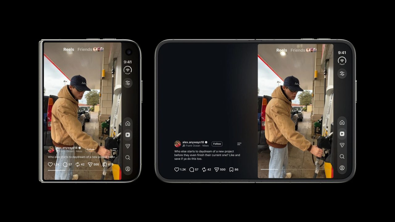
Adam Mosseri, the head of Instagram, has acknowledged that redesigning the social media platform for the Apple iPhone Duo will be “pretty challenging.” In a post on Threads, Mosseri noted that while the team is working on the adaptation, he believes it is difficult to create an experience that feels natural on the device’s unique form factor. He added that his conclusion becomes more apparent as he examines the specific details of the hardware.
The iPhone Duo presents a significant design hurdle because its screen, even when folded, is wider and shorter than typical smartphones. Mosseri explained that Instagram was originally engineered for tall, vertical displays, leading to layout conflicts on the Duo. A primary example of this friction is the placement of navigation buttons on the right side of the screen. While this positioning is ergonomic when the device is closed, it conflicts with the location of action buttons like Like, Comment, and Share in the Reels section, resulting in a cluttered “double stack of buttons” that the team needs to reconsider.
In response to user comments, Mosseri agreed that portrait mode offers the current best experience for Reels, as the larger screen utilizes the display efficiently. However, he emphasized that Instagram is actively working to improve the interface for other orientations. The optimized Instagram app for the iPhone Duo has been available globally since October 23, but it has faced criticism from users who reported that the interface, particularly the stacked buttons, looks poor. Mosseri’s comments appear to address these complaints while setting expectations for future updates to the app on the foldable device.
Why do we need foldables anyway? Just make it work on regular phones first. Feels like premature optimization.
I hope they fix it quickly. Right now it feels like playing Tetris just to find the share button. Painful.
Finally an honest admission! Most companies just ignore foldable quirks until users revolt. Good luck fixing that button mess.